 how-to
7 Steps to Choose Art for a Neutral Room
Table of Contents
- Start With the Room's Light and Undertones
- How to Choose Art for a Neutral Room by Scale and Proportion
- Pick a Color Palette Using the 60-30-10 Rule
- Choose Between Abstract, Line Art and Photography
- How to Pick Art That Goes Together in a Calm Space
- Neutral Wall Art for Living Room Walls That Add Texture
- Hang Your Pieces at the Right Height and Place Them With Intent
- Book a Live Preview of Your Chosen Pieces Before You Buy
- Frequently Asked Questions
Last Updated: November 7, 2026
Start With the Room's Light and Undertones
Learning how to choose art neutral room spaces starts with the light, not the frame. The same beige wall can look warm at noon and gray at dusk, so the art you pick has to hold up in both.
A neutral room is never truly one color. Walls, linens, wood and metal each carry a warm or cool undertone. Before you shop, stand in the room at three times of day and note which way the walls lean.
Here is a quick way to check:
- Warm undertones: Beige, cream, greige with yellow or pink hints. Look for art with ochre, rust or sand tones.
- Cool undertones: Gray, taupe, white with blue or green hints. Look for art with slate, blue-gray or soft green.
- Mixed rooms: Choose art that bridges both, such as a warm black-and-white photograph.
Light matters just as much. North-facing rooms look cooler, while south-facing rooms bring out warmth. Art printed on archival materials is better suited to holding its color under both daylight and lamp light.
Watch out: Testing art only under store lights is a common mistake. Preview it, where possible, in the room where it will hang.
Use this quick guide to match art to your room's undertones.
| Undertone | Look for art with | Blend option |
|---|---|---|
| Warm (beige, cream, greige) | Ochre, rust, sand | Warm black-and-white photograph |
| Cool (gray, taupe, white) | Slate, blue-gray, soft green | Warm black-and-white photograph |
| Mixed | Pieces bridging both tones | Warm black-and-white photograph |
How to Choose Art for a Neutral Room by Scale and Proportion
Scale decides whether a neutral room feels calm or empty, so when you choose art neutral room walls need the right proportions. Art that is too small disappears into the wall, and art that is too large overwhelms the space. A useful starting point is to make the piece about two-thirds the width of the furniture beneath it.
Scale also depends on how much open wall you have. Because neutral rooms rely on negative space, one large piece often works better than several small ones.
Sizing a Single Statement Piece
A single statement piece works well when it has room to breathe. Measure the wall, then use tape on the floor or paper cutouts to test sizes before you commit.
For a single large work, the frame should cover roughly half to two-thirds of the wall above a sofa or console. This keeps the eye focused on the piece rather than the surrounding paint. Large-format photographs are well suited to this role.
Balancing a Gallery Wall
A gallery wall adds richness to a neutral room, but it needs structure. Lay the pieces out on the floor first, then keep the spacing between frames consistent, usually two to three inches.
Mix sizes deliberately. One large anchor piece, two medium works and a few small accents create balance without clutter. Keep the palette tight, using one or two tones that repeat across the grouping.
Pick a Color Palette Using the 60-30-10 Rule
The 60-30-10 rule gives a neutral room a clear color structure. Roughly 60 percent of the room is the dominant base color, 30 percent is a secondary color, and 10 percent is an accent. Art can be a good place to introduce that 10 percent accent without repainting.
For a neutral room, the 60 percent is your walls, the 30 percent is upholstery or large furniture, and the 10 percent can come from the artwork. The mechanism most designers use is extraction, not invention: pull the accent from a color that already exists in the art, then repeat it in one or two secondary objects, a pillow, a vase, a lamp base, a book spine. Repetition is what makes the accent read as intentional rather than accidental.
Match the Accent to the Room's Undertone
The accent has to agree with the undertone you identified when you checked the light. A warm greige wall with yellow or pink hints pairs cleanly with ochre, rust, terracotta, or sand. A cool gray or taupe wall with blue or green hints pairs with slate, blue-gray, sage, or soft green. If you put a cool slate accent against a warm beige wall, the beige will look dingy next to it, the contrast exposes the undertone instead of supporting it.
Mixed-undertone rooms are the hardest case. The reliable bridge is a warm black-and-white photograph or a piece with a true neutral (a gray that sits between warm and cool) plus one small warm or cool note. That gives the eye a resting point without committing the room to a temperature.
Test the Accent Under Both Light Sources
A neutral accent can shift more than a saturated one because there is less pigment to anchor it. A sandy beige that looks warm under a 2700K lamp can read almost gray in north-facing daylight. Before you commit, hold a paint chip or a printed swatch of the accent color next to the art in the room at midday and again in the evening with the lamps on. If the accent changes character between the two, choose a slightly warmer or cooler version until it holds.
Monochromatic Is a Valid 10 Percent
Monochromatic art is a safe choice here. A single-hue photograph in sandy beige or muted ochre adds depth without competing with the room, and it lets the 10 percent accent come from texture or a metallic rather than a second color. Many homeowners find that one well-chosen accent color feels more intentional than several small pops, and a monochromatic piece makes that single accent easier to control.
Watch out: Do not let the accent appear only in the art. A 10 percent color that exists nowhere else in the room reads as a mistake rather than a choice, repeat it at least once in a textile, ceramic, or lamp.
Choose Between Abstract, Line Art and Photography
Each art type changes the mood of a neutral room, so match the style to what the room needs.
- Abstract prints: Good for adding color and movement. They suit open-plan spaces where the art becomes a focal point.
- Line art: Works well in minimalist rooms. Its thin strokes add detail without visual weight.
- Photography: Brings texture, place and emotion. A landscape photograph can make a neutral room feel grounded and calm.
Photography is especially strong in neutral spaces because it introduces real-world color and texture. Fine art photography printed large and framed well can act as the room's anchor, the way a sculpture would in a gallery.
Consider the room's visual weight. A dense abstract canvas may feel heavy in a small room, while a light line drawing may disappear in a large one.
How to Pick Art That Goes Together in a Calm Space
Art that goes together shares a thread. That thread can be color, subject, or simply mood. In a calm space, consistency matters more than variety.
Start by choosing one shared element. It might be the same warm neutral in every frame, the same black-and-white treatment, or a common horizon line in a series of landscapes. Pieces from the same artist or series often share this quality.
Keep frames consistent too. Matching finishes, such as natural wood or thin black metal, tie separate works together. In-house framing helps keep a collection visually unified.
Neutral Wall Art for Living Room Walls That Add Texture
Texture keeps a neutral living room from feeling flat. Since color is limited, texture carries interest.
- Matte finishes: Soften light and feel quiet.
- Natural materials in frames: Wood, linen-wrapped mats and brushed metal add tactile depth.
- Layered depth: A slightly dimensional framed piece, or a photograph with fine grain, adds richness.
For a living room, place a textured piece near a natural material such as a wool rug or woven chair. The contrast makes both feel more considered.
Hang Your Pieces at the Right Height and Place Them With Intent
Hang art so the center of the piece sits at about eye level, roughly 57 to 60 inches from the floor. Above a sofa, leave about 6 to 10 inches between the top of the furniture and the bottom of the frame so the two feel connected.
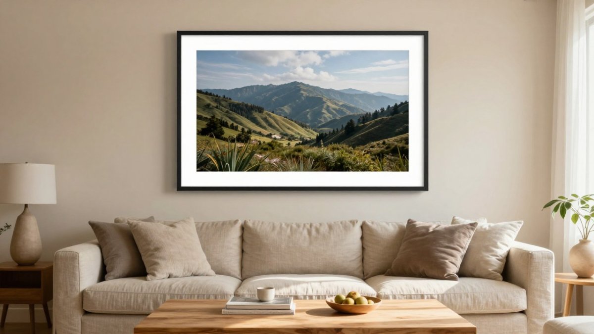
Place art with intent. Hang the largest piece where it will be seen first, such as the wall you face when you enter. Use the piece to draw the eye toward a view, a window or a seating area.
A large framed fine art landscape photograph hung at eye level above a low sofa, in a sunlit room with warm beige walls and linen cushions, shows this balance well. You can see a serene, light-filled example in Lighthouse Lift-Off, currently available for purchase.
Watch out: Hanging art too high is the most common placement error. When in doubt, lower it.
Book a Live Preview of Your Chosen Pieces Before You Buy
Before you commit to a large piece, see it in your own room. Augmented reality previews can help you place a work on your wall and check scale and color before ordering. You can also visit the Key West gallery or contact the team to talk through your options.
Once you have a shortlist, preview each piece in the room, check how it sits beside your furniture, and confirm the palette still feels right. Taking this step helps you buy with confidence rather than guesswork.
Choosing art for a neutral room is about balance: light, scale, palette, and texture working together. At DE LA Gallery, we create large-format fine art photography that gives a calm room a clear focal point. Explore our collection and use our live preview to find the piece that belongs in your home.
Frequently Asked Questions
What is the 60-30-10 rule for decorating a room?
The 60-30-10 rule splits a room's color into three shares: about 60 percent dominant color, 30 percent secondary color and 10 percent accent. In a neutral room, the dominant share is usually the wall and large furniture in soft whites, beiges or greige. The secondary share might be textiles or wood tones. The accent share, often 10 percent, is where a piece of art can add a focal point, such as a warm ochre or muted terracotta tone pulled from a photograph. Using this split keeps the room calm while still giving the art a clear role.
How high should artwork be hung in a living room?
A common guideline is to center artwork at about 57 to 60 inches from the floor, roughly eye level for most adults. Over a sofa or console, leave about 6 to 10 inches between the bottom of the frame and the top of the furniture so the piece feels connected to it. For a large wall, measure the grouping as one unit and center that unit rather than each frame. Adjust the height if the room has very high or very low ceilings, and always check the placement with painter's tape before drilling.
Can colorful art work in a neutral room?
Yes. A neutral room gives colorful art more room to stand out, as long as the color is chosen with intent. Pick one or two colors from the photograph or artwork that repeat in a pillow, rug or vase. A single saturated piece can serve as the accent in the 10 percent share of the palette. Avoid hanging several bright pieces together, since they compete for attention and make the calm background feel busy.
What colors look best in a neutral room?
Warm neutrals such as sandy beige, cream and muted ochre pair well with earthy art tones like olive, rust and deep brown. Cool neutrals like gray, greige and soft white suit blue-gray, charcoal and black-and-white photography. Match the undertone of the art to the undertone of the walls and flooring, since a warm print can look yellow against a cool gray wall. Testing a sample print in the actual light of the room before framing helps confirm the match.